
Congratulations! You’ve made the right call by choosing WordPress for your blog. All that’s left is to build it. Luckily for you, the CMS powers over 40% of the internet, so inspiring examples are not lacking.
Over the past six years working with WordPress, I’ve come across hundreds of websites in all kinds of niches. I took the liberty of compiling the 20 best ones ‒ 15 from top industry names and 5 small blogs. You’ll find a wide variety of blogs to compare, from enterprise-level ones from big brands all the way to blogs run by individuals and small businesses.
Each listing will highlight unique elements you could use for your blog ‒ content, design, monetization methods, and more.
15 popular blogs built with WordPress
I always associate a blog as something that keeps evolving, from the number of content published to its format at times. People and businesses can use it to share ideas, promote products, build their brands, and achieve other goals online.
The following are just some of the big brands that trust WordPress for their blogging journey. You’ll see how scalable WordPress is for different blog sizes and niches, and how large businesses use it for their needs.
I’ll also recommend the best free and freemium plugins and themes to help you recreate their style and functionality for your own blog.
1. TED Blog
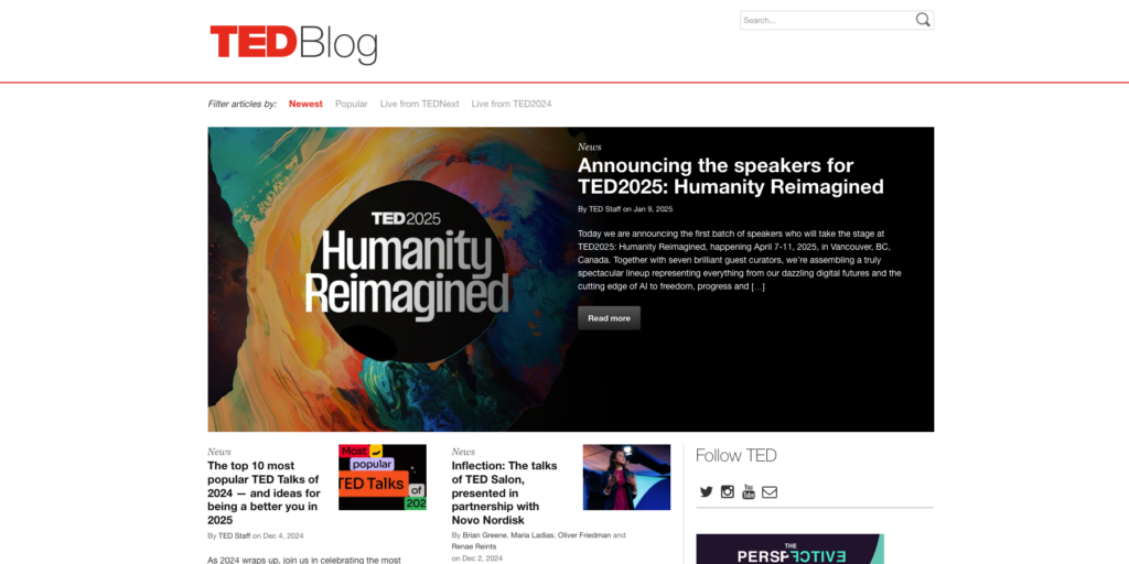
TED Blog is the non-profit organization’s official news space covering inspiring stories, upcoming events, and commentary on past conferences. It focuses on topics like global issues and humanity ‒ a popular platform for finding valuable insights and tips for self-improvement.
The posts are easy to read and accessible, with plenty of whitespace and clear, concise image descriptions.
Finding specific articles couldn’t be easier with the filter on the top menu bar. You can search by popularity, publication period, and relevant live events. There’s also a search bar to find a specific post or writer. Alternatively, curate the results using author tags under each post’s title.
Social media icons and the newsletter signup button are noticeable but not distracting. The same goes for the ads on the right side of the page.
Overall, it’s a great blog to draw inspiration from if you want to create a text-heavy one.
Recommended tools:
- Theme: ColorMag or Public Opinion
- Plugins: TranslatePress and SearchWP
2. Rolling Stone

Keeping readers coming back is tough for most blogs, but not for Rolling Stone.
At first glance, the unique shade of red and bold fonts make the text pop. The highlighted post stands out with a larger featured image in the center. Hovering over the page changes section colors, encouraging you to keep reading as you interact with the page.
The posts are no less captivating, with some swapping featured images for hero video headers. The clean white background contrasts with the bold black font, making reading effortless. Occasionally, a popup video appears in the bottom right corner, featuring the latest trending news.
As for monetization, Rolling Stone makes banks through its subscription system and ads. The latter are placed so seamlessly across the website that I hardly noticed them.
Recommended tools:
- Theme: Themify Basic or Tenzin News Magazine
- Plugins: Depicter and Forminator Forms
3. NASA News
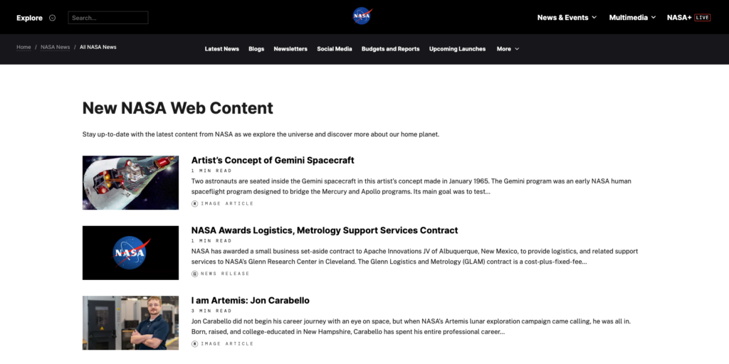
NASA’s news corner adopts a classic blog look with a minimalist, clutter-free layout. It has plenty of whitespace and featured images with each post. Bonus points for adding reading time to each post.
Posts with a reading time of over five minutes include a table of contents on the left for easy navigation. Social media icons are conveniently above it, encouraging social sharing. Some posts feature hero video headers with descriptions and credits at the bottom.
If I had to nitpick, I’d say the filter is not that accessible. Finding related articles is easy, thanks to the Related Terms tags on each post. However, looking up a term in the search bar shows results from the entire site ‒ only then can you use filters to narrow them down.
Recommended tools:
- Theme: Blogpeak or BlogBend
- Plugins: Ajax Search Lite and Blog Designer
4. Ahrefs
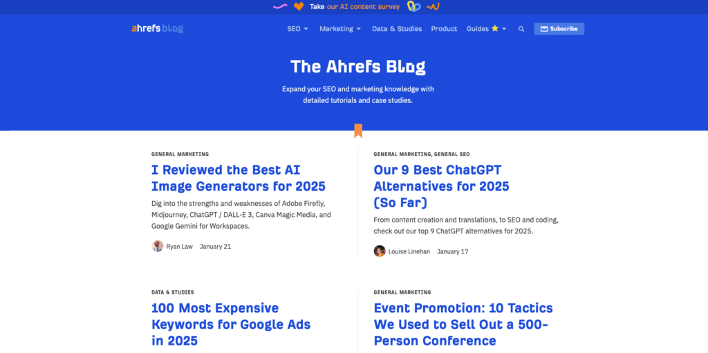
Ahrefs Blog is the go-to place for anything related to search engine optimization (SEO). It uses a two-column layout for readability on all screen sizes, with heading colors matching the header to draw interest.
Tags are accessible on the top of each post to help with navigation, along with the respective author. The pagination redirects you to the archive page, where you can search by category or browse the collection by headings.
Each post includes reading time, a table of contents, and the author’s bio. Being a leader in SEO, it also displays organic traffic numbers and backlinks to the post. I think this is a clever way to promote Ahrefs’ tools and invite visitors to join their newsletter.
The best part? There are no annoying popups or intrusive ads.
Recommended tools:
- Theme: Vantage or Sydney
- Plugins: TaxoPress and Simple Author Box
5. Harvard Gazette
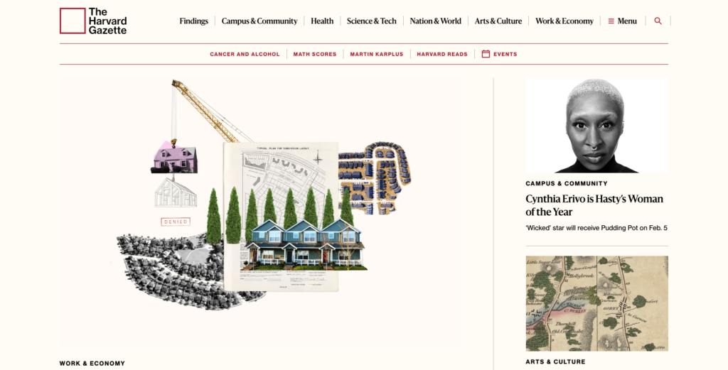
Harvard University’s news site gives out a sense of prestige and integrity with its contemporary design, muted cream palette, and minimal animation effects. The available space is well-organized, showcasing featured posts, news, and events without overcrowding.
I have a soft spot for websites with sticky navigation that let visitors switch pages without scrolling back up ‒ a handy feature for sites with long posts. The mega menu bar helps keep everything organized and clutter-free.
Visitors can sign up for the newsletter through a button in posts. The placement is a bit more hidden than I’d like, but I doubt educational organizations see growing their email list as a priority.
Recommended tools:
- Theme: Storyline Blog or Minimalist Blogify
- Plugins: Max Mega Menu and WPFront Scroll Top
6. For the Record (Spotify)

Spotify’s blog page reflects its branding as a popular music and podcast platform to the tee ‒ energetic and trendy. Entering the page for the first time, we see a vibrant hero slider with animated text. Rectangular images with popping colors create sections on the page without needing lines or grids.
Calls to action are minimal and only appear at the bottom, redirecting to topic categories. A newsletter signup form sits below it, framed by the word “Newsletter,” so you can’t miss it.
What stands out to me is the clever use of sliders to keep the layout tidy. This makes room for attractive visuals, improving user retention and the blog’s overall aesthetics.
Recommended tools:
- Theme: Blogair or Blogone
- Plugins: Greenshift and Spectra
7. Ladybird Education
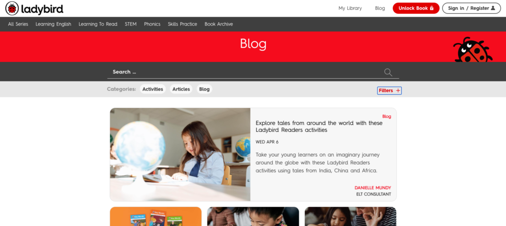
Ladybird Education provides books, educational articles, and teaching materials to help children learn English. Since the target audiences are parents and children, the design is simple and sweet, with a ladybug-themed color palette. The playful font matches the blog’s fun vibe while staying readable.
The blog uses WordPress’ registration system to manage access to free downloadable materials. You can adapt it to foster your own community and offer exclusive content to site members ‒ a common strategy to make money blogging.
My favorite part is the filters. Just select the appropriate tags, series, age, and reading level from the options and apply them ‒ no typing needed. This approach minimizes the risk of typos and makes the blog kids-friendly.
Recommended tools:
- Theme: School Education Lite or Educational Blocks
- Plugins: Ultimate Member and Use Any Font
8. TIME
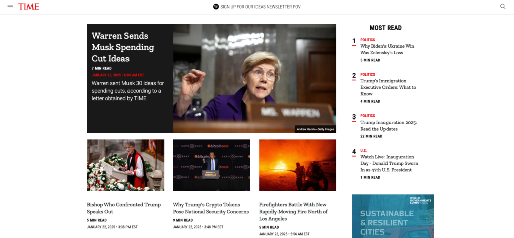
The global media brand TIME shapes its WordPress blog into a robust information hub that features articles about global news. The sections are tucked in a collapsible sidebar menu, keeping the layout clean.
Trending news takes center stage, accompanied by a large featured image. The most-read articles are highlighted in the section on the right, ranked to grab readers’ interest. There are also Editor’s Picks and Videos sections at the bottom of the page.
TIME generates revenue by offering subscriptions through a popup when you first visit the blog and a call to action in the sticky navigation bar that follows you when scrolling. It also runs ads on several spots across the page (the homepage has three). I wish they were less on the nose, but these methods do draw attention to what the company wants you to see.
Recommended tools:
- Theme: Highlights News or NewsPaperss
- Plugins: Members and Ad Inserter
9. Playstation.Blog
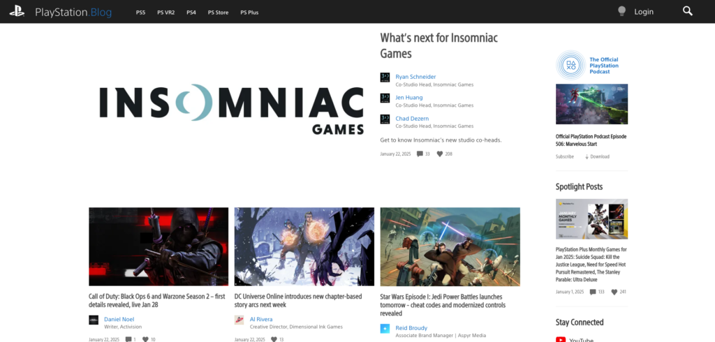
The popular gaming console’s official blog covers news, events, and updates on its library of games. You can filter posts based on console or game versions and switch to another language as you open the page. Alternatively, use tags and author bios in posts to find specific topics or posts.
Call-to-action buttons for consoles and Apple podcasts are subtly placed throughout the blog. All the usual footer content is placed in the right sidebar, below featured posts and social sharing.
A nice detail I like is the loading animation featuring PlayStation’s four iconic symbols. The one thing I’d change is adding a scroll-to-top button to complement the ability to load more posts.
Logged-in users can comment and like posts. The number of likes, comments, and author’s responses appear under each post’s heading to showcase its popularity.
Recommended tools:
- Theme: NewsWP or Spiel
- Plugins: Wordfence and Akismet Anti-spam
10. Minimalist Baker
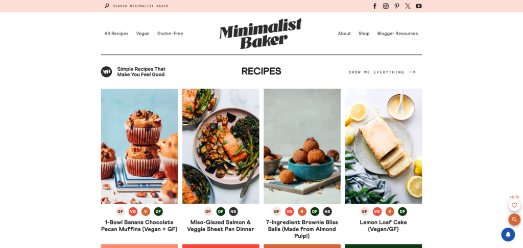
If you want to start a food blog, Minimalist Baker can show you how it’s done. This popular food blog uses eye-catching cuisine photos with each recipe to attract clicks. Tags are cleverly disguised as food labels underneath, letting you filter recipes by diet.
The Pick of the Week section features trending or lesser-known recipes. Readers can like recipes, too, helping the most popular ones show up on the homepage ‒ a clever way to circulate content while keeping things tailored to what people enjoy.
Minimalist Baker is one of the big blogs that don’t shy away from monetization. It shows ads in blog sections and popups and includes affiliate links in posts. An integrated shop allows people to buy kitchen appliances directly from the blog.
My favorite element is the navigation button on all posts that lets visitors jump straight to the recipe. The introduction can be long, so it saves you from scrolling too much.
Recommended tools:
- Theme: Food Recipe Blog or Elegant Recipe Blog
- Plugins: Ivory Search and Popup Maker